We maintain several market timing models, each with differing time horizons. The "Ultimate Market Timing Model" is a long-term market timing model based on the research outlined in our post, Building the ultimate market timing model. This model tends to generate only a handful of signals each decade.
The Trend Asset Allocation Model is an asset allocation model which applies trend following principles based on the inputs of global stock and commodity price. This model has a shorter time horizon and tends to turn over about 4-6 times a year. In essence, it seeks to answer the question, "Is the trend in the global economy expansion (bullish) or contraction (bearish)?"
My inner trader uses a trading model, which is a blend of price momentum (is the Trend Model becoming more bullish, or bearish?) and overbought/oversold extremes (don't buy if the trend is overbought, and vice versa). Subscribers receive real-time alerts of model changes, and a hypothetical trading record of the those email alerts are updated weekly here. The hypothetical trading record of the trading model of the real-time alerts that began in March 2016 is shown below.

The latest signals of each model are as follows:
- Ultimate market timing model: Buy equities*
- Trend Model signal: Bullish*
- Trading model: Bearish*
Update schedule: I generally update model readings on my site on weekends and tweet mid-week observations at @humblestudent. Subscribers receive real-time alerts of trading model changes, and a hypothetical trading record of the those email alerts is shown here.
A disappointing January
The month of January turned out to be a disappointing. Stock prices roared ahead out of the gate and pushed major market indices to fresh all-time highs. By the end of the month, the market had retreated to end the month slightly in the red. More importantly, the monthly chart printed a graveyard doji, which is often interpreted as a sign of trend reversal.

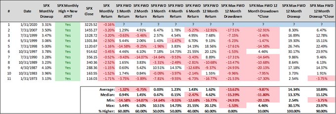
Steve Deppe studied past instances when the market rose 3% or more, set a fresh new all-time high, but finished in the red for the month. While the sample size is not high (N=10), the historical results reveal a heightened probability of large drawdowns in February.
The melt-up hangover may just be beginning.
The full post can be found here.
