We maintain several market timing models, each with differing time horizons. The "Ultimate Market Timing Model" is a long-term market timing model based on the research outlined in our post, Building the ultimate market timing model. This model tends to generate only a handful of signals each decade.
The Trend Asset Allocation Model is an asset allocation model that applies trend following principles based on the inputs of global stock and commodity price. This model has a shorter time horizon and tends to turn over about 4-6 times a year. In essence, it seeks to answer the question, "Is the trend in the global economy expansion (bullish) or contraction (bearish)?"
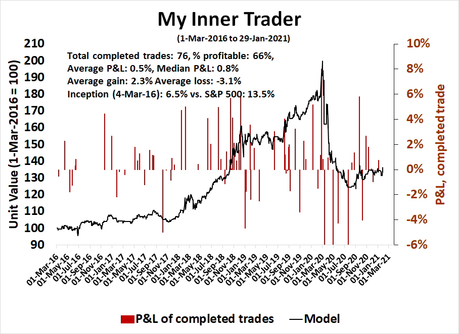
My inner trader uses a trading model, which is a blend of price momentum (is the Trend Model becoming more bullish, or bearish?) and overbought/oversold extremes (don't buy if the trend is overbought, and vice versa). Subscribers receive real-time alerts of model changes, and a hypothetical trading record of the email alerts are updated weekly here. The hypothetical trading record of the trading model of the real-time alerts that began in March 2016 is shown below.
The latest signals of each model are as follows:
- Ultimate market timing model: Buy equities*
- Trend Model signal: Bullish*
- Trading model: Bearish*
Update schedule: I generally update model readings on my site on weekends and tweet mid-week observations at @humblestudent. Subscribers receive real-time alerts of trading model changes, and a hypothetical trading record of those email alerts is shown here.
Subscribers can access the latest signal in real-time here.
Here comes the pullback
I have been increasingly cautious about the tactical market outlook for the past few weeks (see Take some chips off the table). Last week's sudden air pocket certainly gave the bulls a fright. Is this the start of a correction, and how can investors and traders spot the bottom?
The daily S&P 500 chart shows that the S&P 500 has definitively violated its rising channel and it is now testing support at the 50-day moving average (dma). The VIX Index spiked above its upper Bollinger Band which signals an oversold condition. The VIX appears to be going on an upper BB ride indicating a more prolonged downdraft.

Looking longer-term, the weekly S&P 500 chart shows that the S&P 500 is just testing its rising trend line. There are nevertheless warnings from the negative 5-week RSI divergence and a rollover in relative strength in the popular ARK Innovation ETF (ARKK).
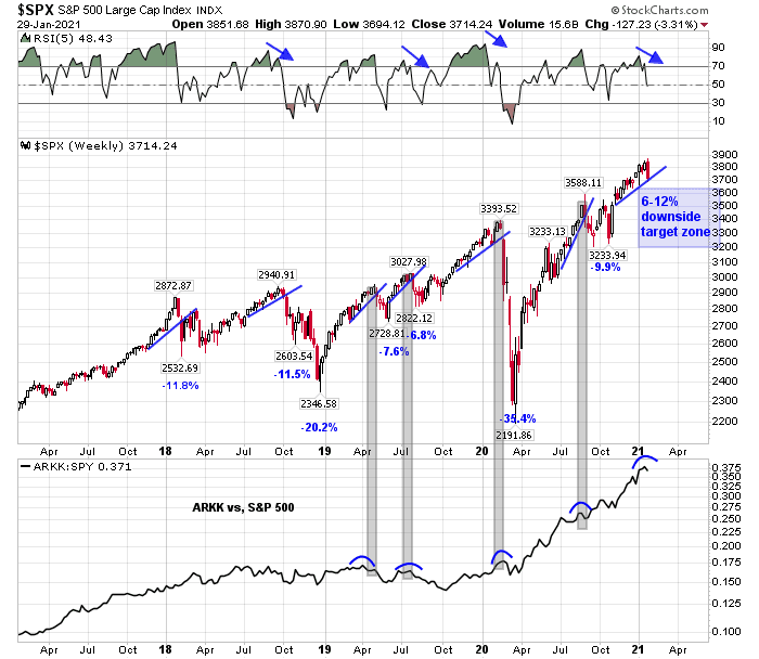
Should the market weaken in line with the historical experience of the last four years, it would translate into a pullback of 6-12% or 3200-3640 on the S&P 500.
The full post can be found here.
